Why I Picked It Up:
I am always on the hunt for nonfiction text structures (click the tabs at the top of this mentor text list). This one came up as a perfect “compare and contrast”!
Why I Finished It:
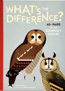
What’s the Difference? asks the reader to consider the difference between pairs of objects, such as a rabbit and a hare, noodles and pasta, The Netherlands and Holland, jeans and denim, closet and armoire, and so much more! I continued reading this book, because either there was a comparison that I had actually wondered about at some point or because I had not thought about it, but was now curious.
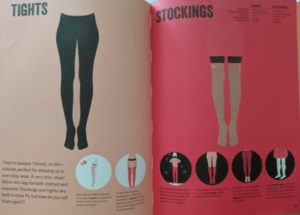
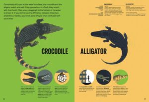
In addition to the book answering natural curiosity, the layout of the information really helps the reader enjoy uncovering the subtle differences between two things. Each spread has a page dedicated to the two items being discussed, has a pop of color with simple graphics, and a small amount of text. The text on each spread is in paragraph form, the listing of facts, and through an infographic-like visual.
Who I Would Give It To:
Honestly, the whole family enjoyed looking through this book together. It started off with me leading the reading and learning, but the book found its way to multiple hands and each person was interested in different comparisons. This would be a book that would be very loved in a classroom library!
Integration Ideas:
Nonfiction Text Structure (compare/contrast)
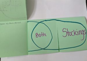
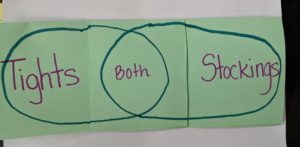
It is so important that our students learn how to read all the structures of nonfiction. If a student does not know what type of structure they are reading (compare/contrast, problem/solution, etc.) then they are entering reading without a plan. It will be infinitely harder for them to comprehend and retain what they are reading. This text very obviously uses a compare/contrast structure. So this is a great STARTER book to teach this type of structure. When teaching compare and contrast, the best graphic organizer (in my opinion) is a Venn Diagram. My favorite way to have students fill out a Venn Diagram is by making a foldable. This way they have a lot of room to write and they are not trying to squeeze all their thinking into little circles.
Writing and Research & Technology Integration
After using this text in Readers’ Workshop it is begging to be used in Writers’ Workshop. Students should choose two items they would like to compare and contrast. Here are some places they can go to help generate ideas:
- Compare and Contrast essay guidance
- Multiple ideas for compare and contrast (leans more towards college essay)
- 16 things most people think are the same, but they are not
- 21 things that are actually different
- Common items that are actually different
Once students, or student groups, choose their topic they will need to conduct research. If they are going to emulate this mentor text, they will need information for a paragraph, listing information, and information for an infographic. Here is some help with research:
- SweetSearch is a fabulous search engine for students
- Customize Google search to help focus your students (and protect them)
- Google has lesson plans to help you teach your students
- Help students refine research skills
Once the students have the information they can use technology of their choice to create their own compare and contrast page spread. Give the students specific expectations, but then let them find tools and create.
This is a great opportunity to give students creative freedom in choosing their tech tools. There are so many tools available, and they each have different strengths. Encourage students to choose based on what they want to create, which requires some preplanning on their part. Do they want to have a labelled graphic? Do they want it to be more infographic-style? Do they want to draw or use photographs? Students might be able to use one tool to create their pages, but they might also choose to use two or three to get the right look. To read more on app-smashing, click here. Here are a few tools they might use:
- Canva: Great tool for creating visuals, compiling separate images into one, or creating infographics. Read our blog post on this tool here.
- Popplet: Create mind maps or show relationships between things or ideas.
- Tagul: Create word clouds in custom shapes to represent ideas.
- RWT Comic Creator



Leave a Reply